Colour Matching with Farrow & Ball
Is it really a perfect match ........
1/20/2020

I have worked with Farrow and Ball paint for Almost 14 years. I started fulfilling my creative urges as a furniture restorer. I went through the chalk based paint but found it tough to work with. I dabbled with various paints in the UK until I landed on Farrow and Ball. Sure it was more expensive but the quality and consistency gave a very luxurious feel. When my clients asked me for wall covering recommendations I would always suggest Farrow and Ball, largely because of the color palette but also because I had first hand experience with the quality.
Fast forward 14 years and Since opening our first US design studio I decided I wanted to become a Farrow and Ball stockiest. I have used it a lot on our clients projects, I felt it gave me that unique something that would align well to my brand. New Clients and contractors I came to work with often mentioned that they had used Farrow and Ball before but was never convenient to get hold of.
Since becoming a stockiest in the summer of 2018 I have had to tailor my recommendations as I have encountered such a divide in consensus about paying a higher price for a top brand product - paint is paint after all?
About 40% of my clients will take my recommendation. After all that’s why they hire me. The other 60% have a really hard time paying almost double for Farrow and Ball versus the Benjamin Moores or Sherwin Williams they have used a million times before. Particularly given that you can take a Farrow and Ball color chart right into your BM or SW supplier and have them color match - identical !
So I thought I would write a a quick blog broken down in to the 3 main areas what you should consider when buying paint - cost; colour and quality.
Color and Quality
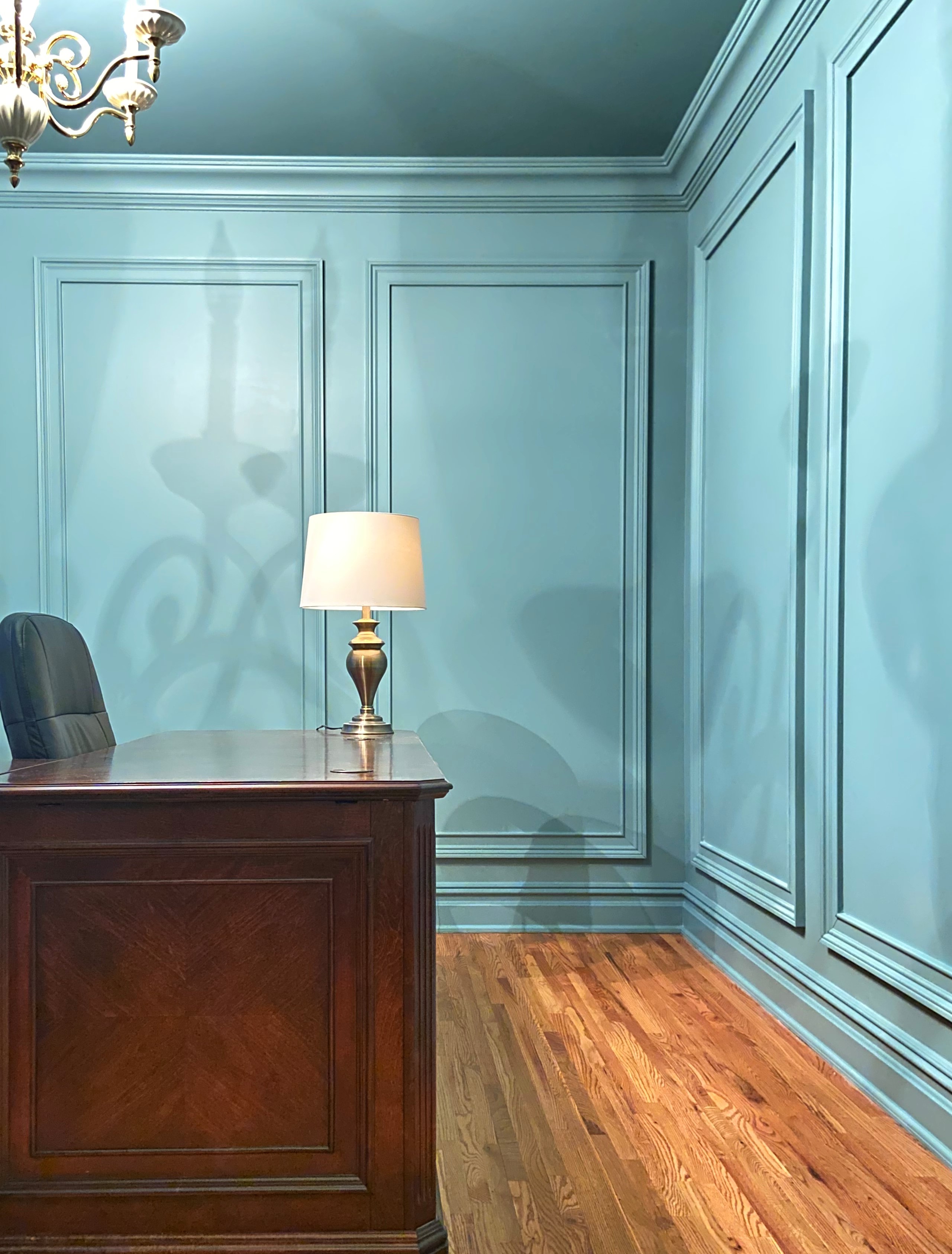
Farrow and Ball has one of the best colour palettes in the market. Farrow and Ball use natural pigmentation to ensure that colours enrich your walls with a luxurious texture and tone. Responding extraordinarily to all types of light, the highly pigmented paint delivers a unique depth of colour and quality of finish which brings walls to life. The rich blend of pigments within each colour create an inimitable vibrancy in every room of the home.
Farrow & Balls have 132 colours from subtle neutrals and muted pastels, to lively accents and rich dark hues. They release a thoughtful balance of timeless and fashionable colours like the 16 new colours launched September 2019 where Farrow & Ball collaborated with The National History Museum (See Blog). These colours have been created with care and thought to ensure they work beautifully alone or as part of a scheme in homes both old and new.
Now we have that marketing jargon out of the way let me share my honest experiences.....
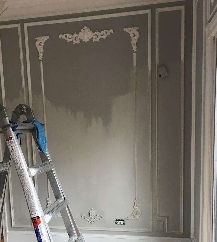
I can completely understand the desire to color match. I did the same in my own home. When I moved in 4 and a half years ago I was 8 months pregnant with our second child. We had fallen in love with a home in a new area to us. My husband and I wanted it perfect (as perfect as you can be in a month prior to a baby arriving). I knew I wanted the family room French Grey and the kitchen all the way through the foyer and up stairs in Pavilion Gray. I hadn’t even opened Nicola Jane interiors at this point and the nearest F&B was New York and Benjamin Moore was just up the road. So yes Sshhhh I colour Matched, I really wished I didn't. The contractor had finished and I sat with this dull paint colour knowing how different it looked. So it had to be redone properly with Farrow & Ball. The two ‘identical colors’ were immensely different and the quality and richness of the Farrow and Ball gray almost gives a pearlescent luxurious feel. Both paints were Pavilion Gray and the difference was night and day.

This is supposed to be a colour match top BM bottom 1st Coat F&B Pavilion Gray
Cost
I have many clients with wide ranging budgets. I have to be mindful of that and have learned lessons over the years on how to deliver the best possible finish without stretching my clients to a point where they are uncomfortable. So I started to consider if Farrow and Ball was too expensive and if in fact, I was missing a huge client base, by recommending F&B. This next part requires some SIMPLE math.......
One gallon of F&B is $110 compared to $72 for Benjamin Moore (Aura). But F&B has a coverage area of 570 sq ft compared to BM Aura coverage of 400 sq ft. So F&B costs around $0.19 per sq ft and BM costs $0.18. Or put another way you get almost 50% more coverage with F&B than you do with BM. When you start to consider the number of coats needed this has a significant impact. In fact, and this is based on experience, you can’t just take into consideration the manufacturers suggested coverage area. Combine this with the overall quality of the product and I have seen some examples where contractors (the good ones) are using 3-4 coats of a cheaper brand compared to the 2 coats of Farrow and Ball.

Summary
I fully expect to get clients who pay $8 for a Farrow and Ball sample pot and color match with a lesser cheaper brand. And the purpose of this blog wasn’t intended to sway those clients. After all, my role is to partner with my clients and provide guidance where they may lack ideas or vision to create a space they will love and use. I have great contractors I work with and they will always deliver an exemplary service and finish. I would encourage any client to consider these few things before committing.
1. If you are buying a F&B tester pot to color match then go one step further. Color match it then apply both to the wall space in question. Make your own mind up as to the quality and finish. Do they look the same and feel the same in varying light throughout the day? Do they have the same depth and give the mood, ambiance and feel you were looking for? Are they even the same color?
2. Give yourself a week with the samples on the wall and keep going back and looking at them. You won’t get to see how each color reacts to the light in different seasons but you should get a good idea of how each color makes you feel in the early morning light and then as the day progresses.
3. Ask your decorator, contractor or interior designer for the coverage area and the number of coats. Then do the math yourself. Work out the cost per square foot and see if you are saving that much money or in fact buying in to a false economy. You won’t be able to determine exact price difference because a cheaper brand may require more coats than F&B but you will at least get an idea. Your initial budget maybe misleading.
4. What room is this going into? Is it a spare room that is infrequently used or in to a new kitchen that you have just spent $25-$150,000 renovating, it matters. A client once gave me their perspective by giving me this analogy - you wouldn’t buy a Mercedes and then put in cloth seats. It’s a luxurious analogy but if I could take that one step further and give you those leather seats for a few cents more than the cheaper brand you would - in a heart beat.
5. Are you happy with your final choice? Based on the collaboration you have done with your designer, the cost and the finished product, do you love what you have? After all it’s your room, your home and your canvas to display your personality and style.

Final thought
So our top tip is to spend that little extra on the paint as this sets the tone throughout the rooms.
Color drives your emotions and your senses. It is part of my job I love - playing with colors and capturing my clients imagination.
Nicola Jane xx
Other notes and Awards
Recognition awards In the British Coatings Federation’s Coatings Care awards, we were named Best Improver in 2015, Overall Winner in 2016, and finalists in 2017 and 2018. These awards are judged on a range of key performance indicators including energy consumption, waste and recycling, and VOC emissions.
Charlotte Cosby, the company's Head of Creative, explains the reasons behind Farrow & Ball's continued success, 'Our paints have high levels of pigment, rich resin binders and high quality ingredients, giving them a unique depth of colour. We carefully source our ingredients from suppliers to ensure you’ll find only the highest quality in each tin. We have a thoughtfully created palette of 132 colours in a range of interior and exterior, modern and traditional finishes. Our paint is meticulously tested, giving you the extraordinary colour and long-lasting finish you expect every time.'
Farrow & Ball's best-selling wall paints are available in three finishes: Estate Emulsion (chalky matt), Modern Emulsion (matt), and Full Gloss. They also do an Eggshell that is perfect for wood and floors, plus Exterior Masonry and Eggshell finishes. Look out for low sheen Specialist Finishes, too.
